R O B E R T D U N T
Click to enlarge images
%2c%202016%2c%20oil%20on%20canvas%2c%2065%20x%2054cm%2c%20%c2%a3895258x314.jpg?crc=463292352)
%2c%202016%2c%20oil%20on%20canvas%2c%2040%20x%2040cm%2c%20%c2%a3495258x261.jpg?crc=79075260)
258x259.jpg?crc=4272700885)
258x261.jpg?crc=3766504802)
%2c%202016%2c%20oil%20on%20canvas%2c%2065%20x%2054cm%2c%20%c2%a3895.jpg?crc=3815707661)
%2c%202016%2c%20oil%20on%20canvas%2c%2040%20x%2040cm%2c%20%c2%a3495.jpg?crc=181833349)
.jpg?crc=294629073)
.jpg?crc=4263252867)
Electricity
2007
Oil on canvas
180cm x 180cm
Private Collection - Marbella
Aqua Gold
2007
Oil on canvas
150cm x 150cm
Private Collection - Marbella
Bijalee
2016
Oil on canvas
76cm x 76cm
Dian
2016
Oil on canvas
142.5cm x 142.5cm
Erekiteru
2016
Oil on canvas
155.5cm x 200.5cm
Electricity (Light Yellow Green and Raw Umber), 2016, Oil on canvas, 65cm x 54cm
Electricity (Orange and Pale Green)
2016
Oil on canvas
40cm x 40cm
Electricity (Autumn Leaves)
2016
Acrylic on canvas
40cm x 40cm
Private Collection - Guildford
Electricity (Light Green and Blue)
2016
Oil on canvas
76cm x 76cm
Desert Blooms, 2017, oil on canvas, 170cm x 170cm, £5760
Jeongi
2016
Oil on canvas
102cm x 76cm
White Noise
2007
Oil on canvas
198cm x 198cm
Private Collection - London
Close
1 - 12
<
>
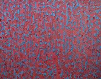
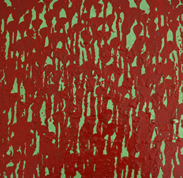
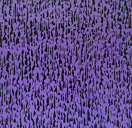
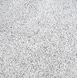
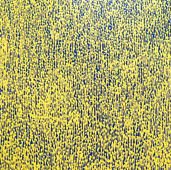
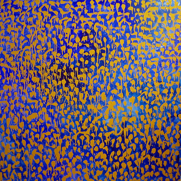
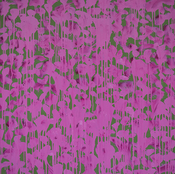
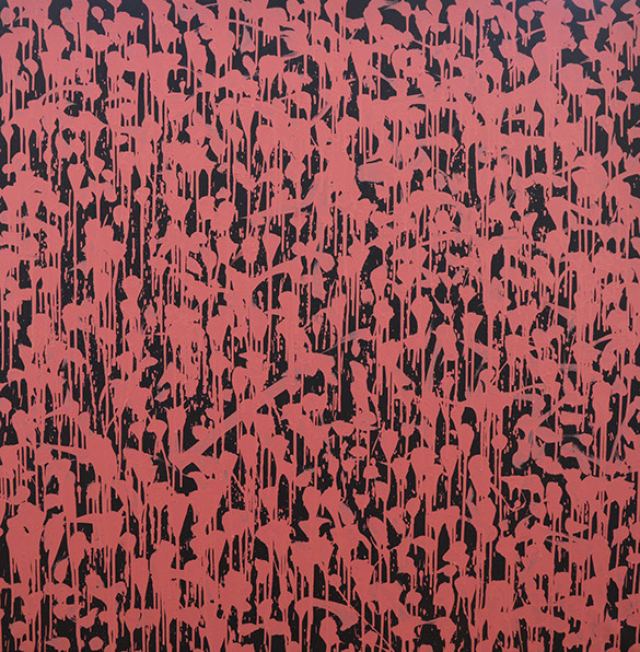
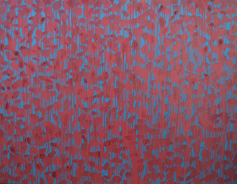
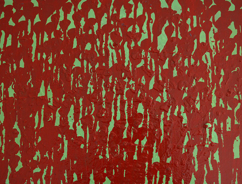
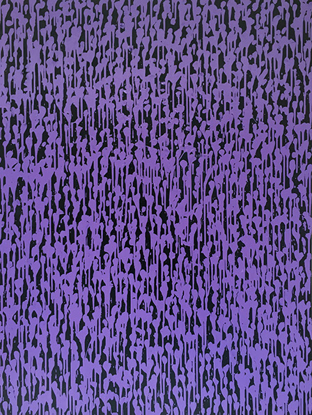
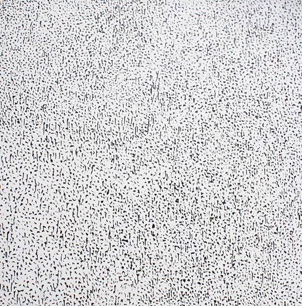
Electricity Paintings
For me these paintings are dealing with colour and space. I’m endeavouring to push simple colour combinations to their absolute limit. For example with the painting Aqua Gold the complementary colours blue and orange, and with the painting Electricity, violet and yellow. I wanted to make the colours resonate in our eyes as much as possible. To a degree I was working within the same sphere of investigation as the pointillists, like Paul Signac.
Similar to the pointillists I wanted the blue and orange colours to mix, not on a painter’s palette, but in our eyes and in our minds. When you mix blue and orange together on the palette you get a brown colour, if you mix them in perfect proportions you get a grey. But by letting them mix in your eye, and your mind, you retain the the pure colour of the original blue and orange. Concurrently with this I was looking to create a sense of space and depth within the paintings.
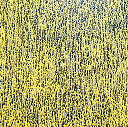
To push the violet and yellow combination in Electricity I started by making the background of the painting as violet as possible. I layered thin coats, or glazes, of the blue/violet colour mixed with varnish and linseed oil. These glazes give an intense resonance, vibrancy and weight to that background colour.
On top are the loosely painted, but carefully placed, yellow marks. This colour was mixed with care to ensure a very high level of pigment to achieve the necessary vibrancy and opacity needed for the picture. When I look at the painting what I find is interesting is that even though the yellow colour is painted on top of the blue, it is the blue/violet ‘negative shapes’ that force themselves forward into my eyes. This adds to the sense of depth and space.
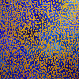
Aqua Gold, and its blue and orange/yellow colour combination is interesting for its contrasts and similarities to Electricity. One of the main differences is that the background here is loosely painted to allow a variation of colour leading to a great sense of depth and movement. The orange/yellow marks on top are, like in Electricity, loosely painted but carefully placed. However in contrast to Electricity they are less densely placed. This allows for longer, languid brush strokes that the eyes can follow. There is also varnish applied to this painting to instil a sparkling sense of glitter.
In particular this shimmering, glittering effect allows what is essentially a non-representational painting to bring to mind things we see and recognise. For instance this sparkling effect calls to mind the experience of watching light flickering on waves in water. Both paintings allude to things we see, perhaps corn or flowers growing in a field, or rain on a window. What’s brilliant is the paintings can melt from one of these experiences to another, as we look at them, and even from there to a more academic, abstract investigation of colour theory.
Both paintings have a different sense of depth and intensity and you can take your eye on multiple different journeys through them. Much abstract paintings is inspired by music and similar to music these paintings have different ‘passages’. There are sections in the paintings where the marks are tighter together or further apart, and these different ‘passages’ allow for a different experience as your eye journeys across the canvas.
You can also get a sense of how my hand moves as I paint the loose marks on the paintings. Patrick Heron wrote beautiful about this experience of being able to see the movement of the artist ’s hand when he was writing about Monet:
“…we are now in love with … the brush-marks which instantly convey the precise movement of wrist and arm through which they came about, with the ‘all-over’ dance of his controlled brush, as it spreads its little explosive blobs and clouds of colour across the picture with so even and consistent a tempo.”